Why Minimalist UI is Dead: The Era of Immersion
For a decade, "Clean" meant "Empty." White space, grey text, and hidden buttons. But in 2026, users are bored. They crave density, texture, and soul. We are declaring the death of boring minimalism.
The Return of Maximalism
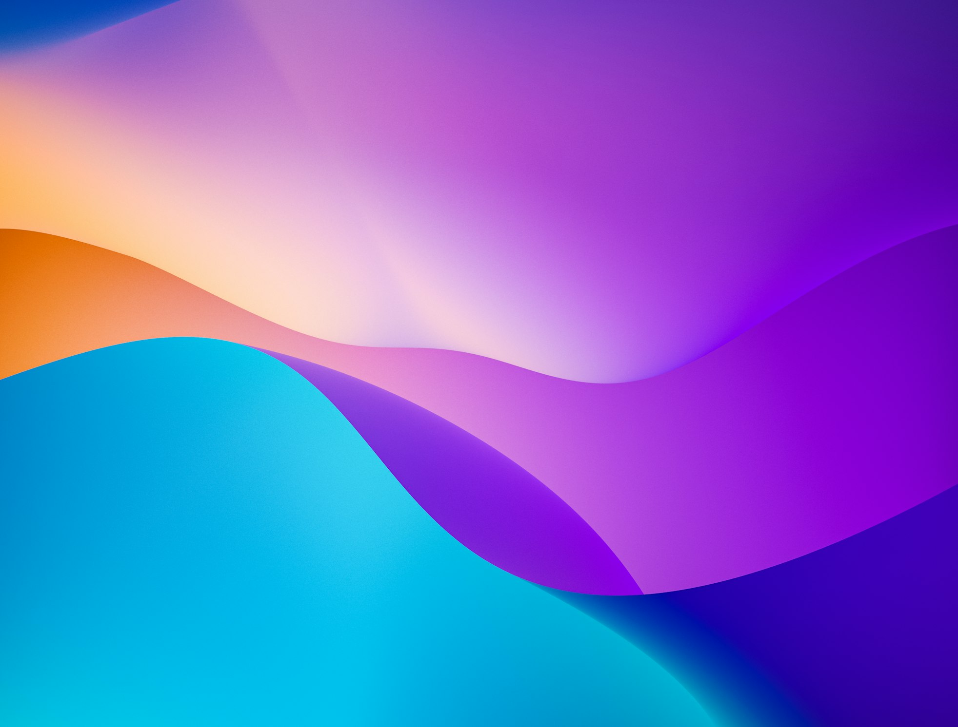
We are seeing a massive shift towards Hyper-Saturation and Glassmorphism 2.0. Interfaces are becoming deeper, utilizing complex gradients and blurs to create a sense of physical material on the screen.
It's about depth. We aren't just looking at screens anymore; we are looking into them. Shadows are deeper, highlights are brighter, and layers feel distinct.
Bento Grids are Here to Stay
Made popular by Apple and Linear, the "Bento Box" layout allows for dense information packing without clutter. It treats every UI element as a card, making responsive design incredibly intuitive.
Why do they work?
- Modularity: You can add or remove blocks without breaking the layout.
- Scannability: Users can digest small chunks of info faster than long lists.
- Aesthetics: They look organized, premium, and tech-forward.
Micro-Interactions Matter
It's not just about how it looks; it's about how it feels. Does the button click satisfy you? Does the page transition feel like butter? These "invisible" details are what separate premium brands from the rest. At 8V Digital, we spend 30% of our dev time just on animations.